Transforming an Investment Property with a Design Makeover
Hi guys,
Julia here. I hope you had a great summer, whether it was spent at the beautiful Jersey shore or somewhere else!
As you may know, we're very close to the beach. However, this summer, I got caught up in a project that kept me busy for a few weeks. We had to transform a house that was quite outdated—let's be honest, it was a bit ugly—turning it into a more attractive and modern space.
I do enjoy these assignments because they require a mix of creativity, strategy, and cost-effectiveness to pull it off. Sure, having endless resources can make almost anything possible, but dealing with an investment property here, our focus was on being mindful of costs and making smart decisions about our design choices and renovation strategies.
The Investment Property before and after our Renovation
Balancing Aesthetics and Functionality
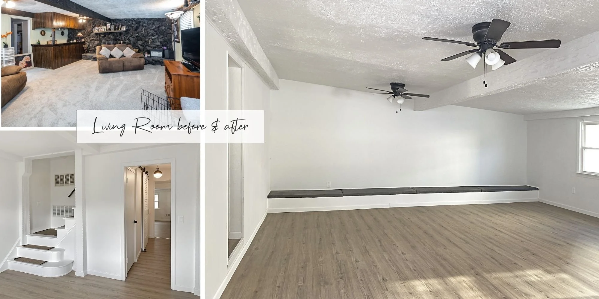
The goal was to maintain an overall neutral vibe but attract a younger, more modern tenant. Everything seemed a bit on the heavy, dark, and kind of old side. The living room had this nautical bar with bullseye and dark brown planks. The wall was decked out in brownish-gray lava stone, beige carpet everywhere, and every window had curtains or blinds in multiple colors.
To be honest, I'm not a big fan of carpets for both hygienic and aesthetic reasons. So, we made the call to rip out all the carpet and go for LVP—Luxury Vinyl Plank—in a light wooden style with a Scandinavian feel. Vinyl is a bit friendlier on the wallet than hardwood; plus, it's more durable and less prone to water issues. However, with a renovation, it's sometimes like a box of chocolate: you never know what you'll get once you remove floors or drywall. So, of course, a lot was out of level, so we had to repair large subfloor areas.
Living Room before and after. We removed lava stone, bar and carpet.
I wanted to give the entire place a light, open, and friendly vibe. We took down all the window treatments, unnecessary shelves, hooks, lights, and anything else we felt cluttered the space. Then we painted everything white, including many beams. I'll admit, I've always been a bit of a minimalist, so going all-white might seem a tad boring to some. But in my opinion, it's a great contrast with the wooden aesthetic, offering the new tenant a chance to add their personal touch with accessories while keeping the house simple and consistent.
Kitchen & Bath Overhaul
Initially, we considered renovating the kitchen, but given the age of the cabinets, appliances, and features, we opted for a complete overhaul. We went for white cabinets, a concrete-look countertop, and stainless-steel appliances. To add a touch of flair, we threw in a funky backsplash featuring beige marble and gold accents, giving the whole look a unique vibe.
An entire new kitchen, new appliances, smooth walls, new floor, light fixtures and outlets.
Out of the three bathrooms, the master bathroom was in such a bad state that the only fix was to start from scratch. I've never seen anything as outdated as that bathroom—with old wallpaper, a shell-shaped sink, weird colors, and a very old shower tub. We went for very large grayish stone tiles for the shower, paired with small, color-matching pebbles for the floor, and kept it simple with a matte white tile. We added in some glass shower doors and a cool, small vanity. We also spruced up the other bathrooms with a bit of color, new vanities, light fixtures, and mirrors—overall, keeping it clean and really simple.
An entire new master bathroom, with walk in shower, renovated bathrooms with new sinks and features in the other two.
Believe it or not, we stumbled on some awesome, brand-new stuff on Facebook marketplace, including a white barn door and some retro fans. It's a bit of a treasure hunt, but if you're up for sifting through loads of stuff, the finds can be totally worth it! Also, we scored some amazing custom stair treads on Etsy and threw in some metal signage, along with new switches, outlets, hardware, and cool lights. All these additions made the house feel modern and cozy!
Savvy Final Touches
We gave the entire house a fresh coat of white paint, applied a white-wash over the red brick front, and ditched the old fence to open up the property. We tossed in a new door, a sleek metal awning, some snazzy custom house numbers, and modern lights. Voila! It was a lot of work but also a blast, and the results are totally worth it!
Newly renovated bedrooms, all in white with new floors, fans, light fixtures, trims, and outlets.
Let me know what you think, and of course, if you're diving into a renovation project, we're here and happy to help ;)
Stay tuned and talk soon!
Best,
Julia


